The Isabella font

By John Stracke (contact me)
By John Stracke (contact me)
This font is called Isabella because it is based on the calligraphic hand used in the Isabella Breviary, made around 1497, in Holland, for Isabella of Castille, the first queen of united Spain.
Dedicated to the late Teresa La Marchant. Teresa prodded me to practice my calligraphy more, and taught me where I was going wrong, and suggested I learn a hand from a primary source instead of a textbook. The source I chose was the Isabella Breviary, so this font exists thanks to Teresa.
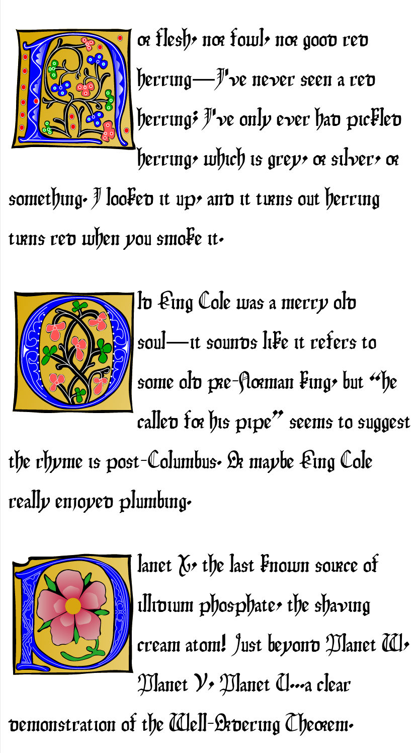
Update, 20 October 2018: released Isabella Capitals 0.9, which provides illuminated capitals, the big, fancy, colored letters that start off some paragraphs in the illuminated manuscripts. Yes, colored: it uses SVG-in-OpenType to provide colored glyphs. (Browsers which don't support SVG-in-OpenType—mainly Chrome— will get the black-and-white versions.) I've got a sample page so you can see how your browser renders it, and a PDF in case your browser doesn't do SVG-in-OpenType. (Unfortunately, the PDF looks a little funky: when I generated it, my browser cut off the bottom of any drop capital that reached the end of the page.)
Isabella Capitals is released under the SIL Open Font License; for the purposes of the OFL, the Reserved Font Names are "Isabella" and "Isabella Capitals". You can download it below. The download includes both OTF (for desktop use) and WOFF (for Web sites).
Update, 9 November 2011: released version 1.202, which moves the half-r ligatures from historic to default status (since it's a historic font, the historic ligatures are the default). Also, the tar and zip files now contain the OpenType version of the font, as well as the TrueType version, for use as web fonts. (These two facts are related—Firefox is the only common application I've found so far that supports ligatures.) I've provided some samples so you can see the ligatures in your browser (or an image if your browser doesn't support it).
Update, 10 August 2011: released version 1.201, which adds the SIL license. (It's actually applied retroactively, but 1.201 is the version where it shows up in the metadata in the font.)
(Update, 5 Mar 2010: released version 1.200, which adds some characters to round out a bunch of scripts. Isabella now has 863 characters; according to fc-query, it supports 140 different scripts.)
(Update, 4 Mar 2010: released version 1.100, which fixes some technical problems detected by fontforge.)
(Update, 9 October 2004: released version 1.002, with a few more characters.)
(Update, 3 July 2005: released version 1.003, which finally gets rid of the ligatures pretending to be Greek letters, and moves them to the Unicode private use area. I was getting tired of seeing, e.g., Cω, show up as Cor. This was something people warned me about almost as soon as I released the font.)
(Update, 21 Nov 2009: released 1.004, which makes the strokes on ł and Ł fit better with the rest of the font.)
It is
dual-licensed, under the terms of
either
the
SIL Open Font License or
the GNU LGPL.
For the purposes of the OFL, the only Reserved Font Name is "Isabella".
Where the LGPL refers to "source
code", I take that to refer to the file called
Isabella-first.sfd,
which is a file for editing with
pfaedit, an outline font
editor program. Thus,
according to the LGPL, if you distribute this font, you must make
Isabella-first.sfd available to the recipient(s) under the terms
the LGPL specifies for source availability. Each of the download links
below is an archive (tarfile or zipfile) which includes
Isabella-first.sfd, the LGPL, a readme, and at least one font file
(e.g., Isabella.ttf for TrueType files). I chose the LGPL instead of
the GPL because, arguably, using the GPL might mean that PostScript
and PDF files with this font embedded would be GPLed (they're like
programs that link to a static library).
Note that earlier versions of this font were released under the GPL. I hereby give everyone who receives a GPLed version the right to use it under the LGPL; that means that files with this font embedded will automatically not be GPLed.
Pfaedit is not GPLed, but its license does seem to count as free software (it's BSD-style, without the advertising clause).
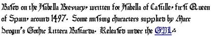
The font has 805 characters (including some duplicates and some characters which are used only as accents for other characters): all of ASCII, Latin-1, Latin Extended A, about a third of Latin Extended B, Latin Extended Additional, plus a bunch of punctuation characters. If you find that some character from your language is not quite right, please be kind; the only languages I've known are Latin, English, Spanish, and German, which means that most of the letters outside ASCII are new to me. (Spanish uses ñ and acute accents on vowels; German uses ß. I had never heard of, say, ogonek, or accents on consonants, before doing this font.) It has a Euro symbol.
Naturally, the Isabella Breviary does not have an example of, say, @, so I drew such characters as best I could. The primary design goal on such characters was to look like something done with a calligraphic pen; the secondary goal was to look like the other characters of the font. So, for example, the © is made by shrinking down the letter "c" and placing it inside a circle.
The original hand, like many medieval hands, has a half-r character, used in ligatures for "or", "pr", "br", and sometimes "dr", "hr" and "ur" (basically, any time the left character is more or less round...plus "u", which isn't round but does show up sometimes). Unfortunately, I have not yet figured out how to get pfaedit to produce ligatures (update 27 Aug 2003: maybe I've got it now...), so instead I'm storing these ligatures in the Unicode private use area. (They used to be Greek letters, but that had nasty side effects--e.g., on my system, Isabella was apparently the first font that Firefox would find when it went looking for, say, omega, and so I would see these ligatures instead of the Greek letters.)
The alphabet wasn't quite the same in 1497. There were no "j" or "w"; I have added them. Unusually, the original hand does have a "v"; many medieval writers used "u" instead. In addition, there was a "long s", ſ, which was used in the middle of words (for which reason it is also called the "medial s", and the modern "s", used at the end of words, is called the "terminal s"); I have provided one. The German ess-zed, ß, originated as a ligature of the long "s" followed by the short "s", so, in this font, I have represented ess-zed as the two "s"es together.
|
|
Formats: |
 (click for more)
|
As of version 1.004, I have stopped providing the PostScript version. There were always problems with it, and current versions of FontForge, when I go to generate the PFA file, warn that it won't support characters beyond the first 255.
| Tarball | Zip file | Other | |
| TrueType (tar and zip include OpenType as well) | Isabella-1.202-ttf.tar.gz | Isabella-1.202-ttf.zip | RPM, OTF |
| Source | Isabella-1.202-src.tar.gz | Isabella-1.202-src.zip | SRPM |
| Tarball | Zip file | |
| Source | IsabellaCapitals-0.91-src.tar.gz | IsabellaCapitals-0.91-src.zip |
| OpenType/WOFF | IsabellaCapitals-0.91.tar.gz | IsabellaCapitals-0.91.zip |
The ampersand ( ) is perhaps too authentic; it's
not really
recognizable to a modern eye. I've provided a more conventional
ampersand as the Unicode character "full width
ampersand" (Unicode character #FF06).
Feedback, anybody?
) is perhaps too authentic; it's
not really
recognizable to a modern eye. I've provided a more conventional
ampersand as the Unicode character "full width
ampersand" (Unicode character #FF06).
Feedback, anybody?