Entry for the Arts Contest at West Kingdom March Crown, A.S. XXXII
by François Thibault
(notes added after the contest are in this typeface)
Introduction
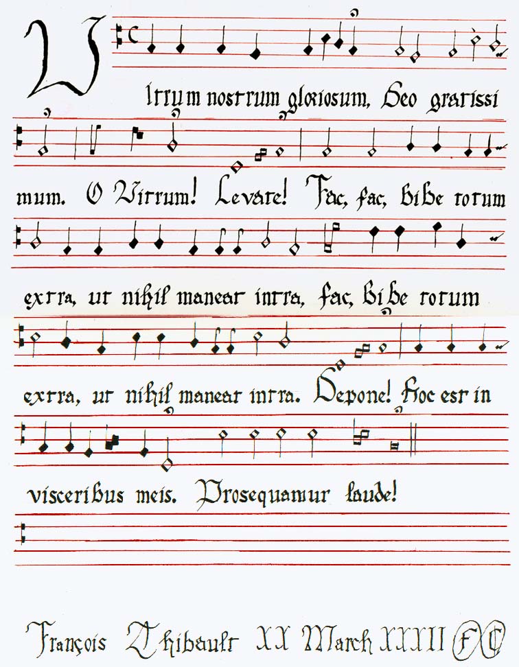
This is the tenor line of the song "Vitrum Nostrum Gloriosum" (which you
may have heard before--Schola Cantorum Occidentalis performs it at the
drop of a mug), a mid-16th-century parody of religious music; it is a song
in praise of drink. A loose translation (my Latin is rusty):
Our glorious drink, (note: a judge for the contest
pointed out this should be "glass")
Thanks be to God.
Oh drink!
Lift it up!
Hey, hey, drink it all out, so nothing is left within; (note:
probably "Do it!" rather than "Hey")
Hey-ey, drink it all out, so nothing is left within.
Put it down!
This is in my tummy.
Praise be.
Sources
The only source I have for the song itself is the sheet music from which
Schola Cantorum Occidentalis performs it (copy attached).
The sources used for the period music notation are:
The
Notation of Polyphonic Music, 900-1600, fourth edition
Author: Willi Apel
Published 1949 by The Mediaeval Academy of America, Cambridge, MA.
Copyright 1942 by the publisher
No ISBN. |
Mellange
de Chansons
Authors: Adrian le Roy & Robert Ballard, Imprimeurs du Roy (1572)
Editor: Charles Jacobs (1982)
Published 1982 by The Pennsylvania State University Press as LeRoy
& Ballard's 1572 Mellange de Chansons
Copyright 1982 by the publisher
ISBN 0-271-00295-6 |
The actual research on the notation was done mostly by Lord Alessandro
chi Maresrale, who pulled the books off his shelf, dug up the right notation,
and wrote out the tricky parts for me. The notation is white mensural
notation, a close ancestor to modern musical notation.
The hand used is Gothic Littera Bastarda (the source, not surprisingly,
is Drogin).
I cannot be certain that this hand was used in 16th-century music--Apel's
printings of period pieces are difficult to make out; and le Roy &
Ballard was apparently printed, not handwritten--but it was used in the
16th century, and it is easy to read, an important consideration for music.
The use of red lines for the musical staves is in imitation of a 13th
century sheet of music which my lady inherited from her grandfather.
I don't know that this practice continued to the 16th century; but I don't
know that it didn't, either, since the sources I have are printed in black
and white. I suspect that the black lines of modern notation may
be a concession to black and white printing; I find the red lines make
the music easier to read, since the notes stand out in higher contrast.
Notes on the notation
For the most part, white mensural notation is comprehensible to people
familiar with modern musical notation. The most obvious difference
is the least difficult: note heads were diamonds and squares instead of
ovals--diamonds are, of course, easier to draw with a calligraphy pen.
Also, the ligatures (notes combined into one symbol) are strange to us;
they indicate what modern notation would depict with a slur (a curved line
stretching across one or more notes): that these notes should not be separated
as sharply as normal.
The lack of measures is a bit inconvenient, but it doesn't keep us from
understanding the music.
The time signatures were substantially different; the C used here is
the only one that looks the same as today, and the meaning has changed--it
meant what we would notate as  ("cut
time").
("cut
time").
The clefs have changed, as well; the clefs here (the  marks at the start of each line) mean "the space (or line) between the
two squares is C". I have placed them to correspond with the modern
treble clef (partly for ease of transliteration, partly so that we can
sing from this music if we want to); but, in period, they were placed wherever
convenient for the composer.
marks at the start of each line) mean "the space (or line) between the
two squares is C". I have placed them to correspond with the modern
treble clef (partly for ease of transliteration, partly so that we can
sing from this music if we want to); but, in period, they were placed wherever
convenient for the composer.
There is a tiny note at the end of each line which indicates the pitch
of the note at the start of the next line; this is a convenience which
was probably useful for people who had to read the music from a distance
(and who may not have been that comfortable with reading in general, so
that they would have had to hunt for the start of the next line).
Educational mistakes
Some notes on things I learned from mistakes I made along the way:
-
In my first draft, I used black lines, out of habit--music is always printed
in black and white, right? This caused me difficulty, because some of the
pencil lines used for ruling the calligraphy were dark enough to be confused
with the staff lines, so that I placed some notes on the wrong staff lines.
In subsequent drafts, I used red lines, as in my wife's 13th-century sheet;
this was a big improvement (though it meant I had to wean myself from the
technical pen).
-
The text needs larger margins above and below each line than is the case
in text-only scrolls. In my first draft, I did alloted an eighth
of an inch above and below (the letters are a quarter inch high, with another
quarter inch for taller letters), and found that the capitals were bumping
up against the bottom line of the staff above, while the staff below had
no room for fermatas (the dot-in-a-half-circle that means "hold out this
note longer than normal"). In subsequent drafts, I set the margins
to a quarter inch each.
-
In my early drafts, I used a completely different hand. At the time,
we believed that my wife's sheet of music was from the 16th century, and
so an appropriate model for Vitrum. The text on that sheet is written
in a fascinating hand, some sort of transition stage between Early Gothic
and Gothic Textura Quadrata. (Most of the letters are Early Gothic,
but some are partway to their later shapes, while the capitals are clearly
Gothic Textura Quadrata.) Also, the letters are rounder and smoother than
most Gothic forms, probably for legibility, so that the sheet could be
held up for the whole choir to read. I was puzzled by the anachronistic
hand, but I theorized that the scribe was writing in an unusual tradition--text
that had to be read at a distance--and might be using a hand developed
much earlier and retained because it was useful. I imitated this
hand for my first two drafts; where the sheet did not provide an example,
I used standard Early Gothic for lowercase and Gothic Textura Quadrata
for capitals. After I'd written the second draft, though, my wife
looked at it and commented that hers didn't have anything like the eighth
notes. I looked again, and sure enough. Oh, well, so it's a
song without eighth notes, right? But then I looked again...and there weren't
any half notes or whole notes, either. Every single note was solid
black. How strange. Hmm. So I pulled out Apel again and looked
at earlier notations, and found Black Mensural Notation (a catchall term
for several notations preceding White Mensural Notation, in which the notes
are solid black). With some more research, I determined that the
notation was probably early 13th century--about the right period for the
hand to be in transition between Early Gothic and Gothic Textura Quadrata.
Very interesting, but it meant that I had to switch to a later hand.
Non-corrected mistakes
In the interests of intellectual honesty, I'll point out a few mistakes
that remain in the piece (of course, I don't claim that these are the only
ones):
-
In the first staff, there's a stray line where I started to write an E
instead of a C (note, not letter). I opted not to fix this (a couple
of similar problems I covered with white gouache), because I feared messing
up the staff.
-
The "i" in the first "Vitrum" is too tall; I took its top to be the half-inch
line instead of the quarter-inch line. If this were somebody's scroll,
I would have started over; but I had just spent an hour or two ruling the
red lines (the nib was being cranky, and I had to move slowly to avoid
blotching), and I decided to let it go.
-
The bottom staff is empty. In earlier drafts, I needed six staves;
in this version, the text came out tighter, and it all fit on five staves.
In an actual period book, of course, this staff would have the start of
another song on it.