 |
 |
| (Click for larger versions) | |
July 26th, 2003: Rounding out the borders, painting in the flowers, vines, and creatures. The borders are largely done now; I just need to do whitework on the right-hand vines and, um, yellowwork on the left-hand vines. Did another interim scan:
|
|
| (Click for larger versions) | |
Used three levels of red, all based on W&N Spectrum Red. The darkest, used for the strawberries and the dark-red flower bits, was pure red; the middle was half red and half W&N Permanent White; the palest was roughly one part red to six parts white. The green (leaves, butterfly, bird's head) is Caran d'Ache Emerald Green; the butterfly spots and the bird's eyes and underbellyl are W&N Primary Yellow. The blue vines in the right-hand border are W&N Sky Blue (reconstituted instead of straight out of the tube, so it's a little thinner than the blue used for the blue backgrounds); the brown vines are W&N Raw Sienna.
July 22nd, 2003: Painting in a bunch of large blue bits: the Burdened Tyger and the background of the left-hand border (and the right-hand middle border, which echoes the left-hand border). Used W&N Sky Blue.
July 20th, 2003: Started painting. Started with the background of the Burdened Tyger device (which is blue on yellow); painted it in Winsor & Newton Designer Gouache Primary Yellow. While working on that, got to thinking about what to do about the left page's border, which, in the original, is gold on green. I had already decided that I would use blue instead of green (the green background in the original, in my opinion, just isn't very attractive); looking at the vines, though, I realized that gold was problematic, too. I've done gold leaf before (including one large-scale case, where the gold leaf was the background); but it's hard in summer humidity, because the size (the glue that holds down the gold) doesn't dry out fully. The alternative is shell gold (paint with ground-up gold mixed in), but I've never really liked the look of shell gold that much. So finally I decided to paint the vines yellow, the same yellow as the background of the Burdened Tyger device. I'll also do the background of the vine borders in the same blue as the Burdened Tyger, so that the borders will complement the device (which is, after all, the whole point of the scroll), rather than clashing with it.
I got to thinking, afterward, about how eager I'd been to pick up a brush and start painting. When I start on a scroll, I can sort of see how it's going to come out, and the vision gets clearer as I go along. I go through several stages before I can get to this point: choosing a hand (a font, basically); sketching the layout; writing out the text to make sure the size matches the layout I want; drawing the artwork in pencil; inking in the artwork and erasing the pencil. This stage (shown below) is the first time I can see clearly what the finished scroll is going to look like. From here on, things start cascading; the further I go, the more real the scroll looks, and the more satisifying it is to work on.
[T]he power of your eyes, which see beauty where it doesn't even exist yet, and draw it up into the solid world, and give it shape, color, and texture. -- Miles Vorkosigan to his lady-love, in A Civil Campaign, by Lois McMaster Bujold.
My lady wife says she has a similar experience when sewing: she starts out knowing what she's going to do, and she makes a plan to get there. But, while working in the plan, all she can see is the plan, not the destination, and she feels like she's navigating in the dark. As she starts sewing pieces together, though, the garment grows more and more complete, and she can see clearly again where she's going. At this point, she's working on the garment, not on the plan, and it feels a lot more real.
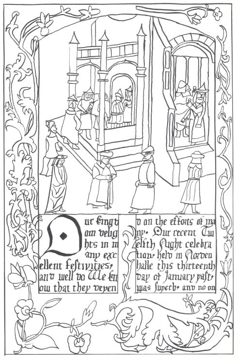
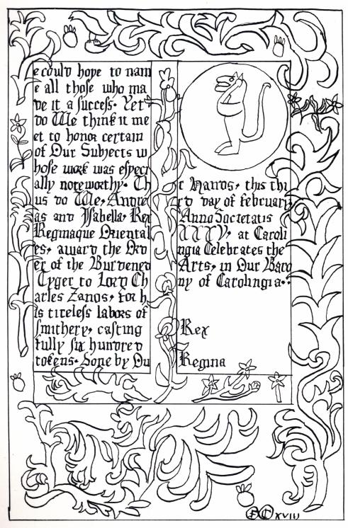
July 19th, 2003: I am currently working on a Burdened Tyger scroll for Lord Charles Zanos. So far, I've got the text written out, and all the drawing done and inked in. I decided to scan in what I've got, to make some kind of record of the progress (as opposed to my usual notes, which are more of a post-mortem). So, currently, the scroll looks like this:
 |
 |
| (Click for larger versions) | |
(it's too big to fit on my scanner all at once, so I scanned the left and right sides separately). I'll probably do products based on another distillation, as I did to create An Afternoon in the Palace. However, in this case, it's going to be a little trickier, because the border on this piece isn't really suited to the kind of editing I did to cut out the text region. The scroll I started with for An Afternoon in the Palace had mostly small flowers in the borders, and I was able to crop carefully and move the bottom border up smoothly. This scroll, though, is based on a different page out of the Isabella Breviary, and has long vines instead; I'm not sure I'll be able to crop them smoothly. I might instead create products with just the central scene. Anybody who has thoughts on this is invited to comment.
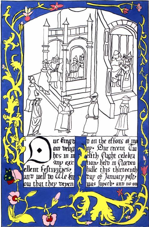
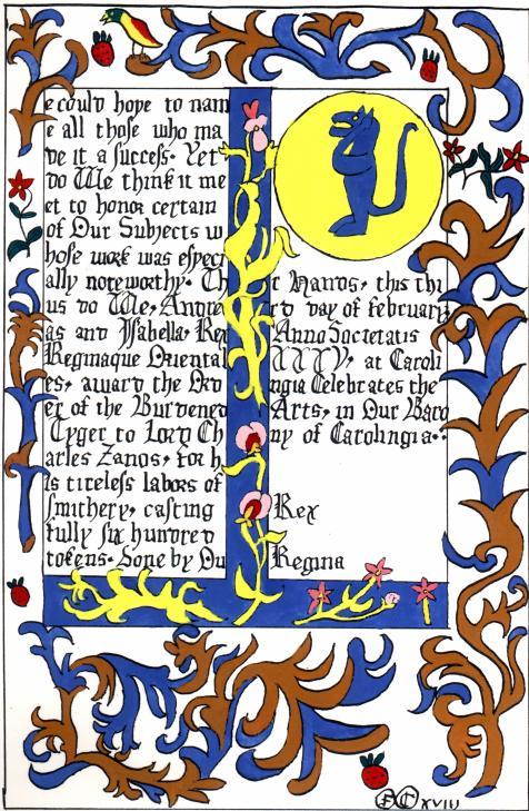
The scroll is based mostly on the Isabella Breviary; I'm working with Janet Backhouse's reproduction book (Copyright 1993, ISBN 0-7123-0269-7, available at Amazon). As for my previous two scrolls in this style, the overall layout is patterned after ff. 184v-185 (on p. 35 of Backhouse): the left page has a large scene, with wide borders, and a little text; the right page has a lot of text, wide borders in a different style, and narrow borders around the text, in the same style as the left page. In this case, the borders of the left page are patterned after those on f. 234 (p. 39 of Backhouse), though I'll probably go for a blue background rather than green. The scene on the left page takes the architecture from that same f. 234, but changes the people so that they're lining up to get into the SCA event where Lord Charles's tokens were being used. If you look closely, you can see that the person at the head of the line is being given a token, and the two people already inside are admiring the tokens they've got.
Most of the people were taken from the scene of musicians waiting in line on f. 184 (p. 35 of Backhouse again); the man with the cane and the one halfway up the steps, with his hands on his hip, were taken from f. 260 (p. 42 of Backhouse). The man inside, looking out the window, is taken from f. 164 (p. 30 of Backhouse); in the original, he's King David. The second-to-last man in line, facing the man with the cane, is taken from f. 90 (p. 18 of Backhouse). The two women in line (at the left of the scene) are taken from another book, largely because the Isabella Breviary is short on women in poses I could use (most are either seated, looking modestly at their hands, or gazing in rapture at angels). I took these women from a Book of Hours by Simon Marmion, dating from about 1450-1475; I'm using a reproduction book by the Huntington Library (Copyright 1976, ISBN 0-87328-130-6, available at Amazon). The two women were taken from plate 12 in the reproduction book (it doesn't specify what page in the original, but it's the scene of Christ being presented in the Temple); they're both taken from the lower-left corner of that scene. The woman who's lower in my scene is the Virgin Mary in the original.